How to read OrderVolume
Everything on the dashboard, explained in plain language — what each part shows, what the terms mean, and how to put the information to work. No jargon without a definition.
1. What OrderVolume is · 2. The dashboard · 2b. The session timeline · 2c. How to use the dashboard · 3. The status chips · 4. The flow ladder · 5. Broker comparison and spread · 6. The basis deviation index · 7. The order-flow strip · 7b. Institutional order flow (CVD) · 2b. OVD (direction) · 8. Observations · 9. Telegram alerts · 10. Referral program · 11. Putting it together · 12. Glossary · 13. What OrderVolume is not
1. What OrderVolume is
When you trade gold as a CFD, the price on your screen comes from your broker. But gold's real price is set somewhere else — on a futures exchange, where the world's biggest participants trade with each other. Your broker's XAUUSD quote follows that reference market, plus their own spread and adjustments.
OrderVolume watches both sides at the same time: your broker's live quotes, and data from the reference market. It shows you how your broker's feed is behaving right now — how wide the spread is compared to normal, whether the pricing is drifting away from the reference, and what the flow of real trading activity looks like underneath.
Think of it as an instrument panel for the conditions you're trading in. It describes what's happening — it never tells you what to do.
One account covers one broker. You told us which broker you use when you signed up. Everything on your dashboard is measured for that broker.
2. The dashboard
Here's the layout of the dashboard, from top to bottom:
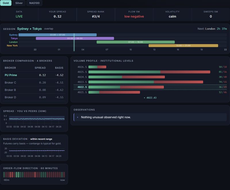
Tap image to view full size. The full dashboard: status chips across the top, session timeline below them, then a two-column layout — broker comparison on the left, volume profile and observations on the right.
Top row: Six small tiles called status chips give you a quick snapshot — is data live, what's the spread, how volatile is the market.
Session timeline: A schedule bar showing which major markets (Sydney, Tokyo, London, New York) are open right now, plus a countdown to the next one.
Left column (narrower): broker comparison table, spread chart, basis deviation chart, and order-flow strip. These are about your broker — how its pricing compares to others and to the reference market.
Right column (wider): the flow ladder (volume profile) showing where trading activity has concentrated at each price level, and the observations feed below it.
Each section is explained in detail below.
2b. The session timeline
The session timeline is a schedule that shows when each major market is open. It sits right below the status chips.

Tap image to view full size. The session timeline showing Sydney and Tokyo currently open with overlap, and a countdown to the London session.
Four rows represent the four trading sessions. Each row has a colored bar showing when that market is open. A glowing vertical line marks right now — so you can see at a glance which sessions are currently running and how far through them you are.
| Session | Opens (UTC) | Closes (UTC) | Color |
|---|---|---|---|
| Sydney | 22:00 | 07:00 | ■ Blue |
| Tokyo | 00:00 | 09:00 | ■ Purple |
| London | 07:00 | 16:00 | ■ Green |
| New York | 13:00 | 21:00 | ■ Gold |
Overlaps: When two colored bars cover the same time, both markets are open at the same time. The header will show both names (for example, "London + New York") with the word "overlap" next to it. Overlaps tend to be the busiest periods, with more volume and tighter spreads.
Next session countdown: In the top-right corner of the timeline card, you'll see which session opens next and how long until it does (for example, "Next: London 1h 24m").
The quiet hour: Between 21:00 and 22:00 UTC, no major session is open. New York has just closed and Sydney hasn't opened yet. Spreads are typically at their widest during this hour.
2c. How to use the dashboard — a quick walkthrough
If you've just opened the dashboard for the first time, here's a simple routine you can follow in about 15 seconds. Each step has a "what to look at" and a "what it tells you."
Step 1 — Check the status chips. Look across the top row. Is Data showing LIVE? Is the spread number small or large? Is volatility calm, active, or elevated? This tells you whether conditions are normal right now.
Step 2 — Check the session timeline. Which market is open? Is there an overlap? How long until the next session? This tells you whether you're in a busy or quiet part of the trading day.
Step 3 — Look at the broker comparison table (left column). Is your broker's spread in line with the others, or higher? This tells you whether your cost to trade is fair right now.
Step 4 — Look at the flow ladder (right column). Where are the heavy bars relative to your current price (the teal marker)? This tells you where the market has been most active — prices the market has spent real effort at.
Step 5 — Scan the observations (bottom right). Any unusual events? If it says "Nothing unusual observed right now," that's good — it means conditions are ordinary.
That's it. You now know the conditions. What you do with that is your decision, using your own method and risk rules. The deeper sections below explain each part in more detail.
2b. OVD — OrderVolume Direction
The small pill labeled OVD is a proprietary multi-timeframe directional indicator. It reflects the net agreement across multiple analytical timeframes that operate on non-standard time intervals — deliberately desynchronized from the standard charts most participants watch.
Reading OVD:
▲ Green arrow up — all analytical timeframes agree on upward momentum.
▼ Red arrow down — all analytical timeframes agree on downward momentum.
— Grey dash — timeframes disagree or data is warming up. No directional consensus.
OVD updates approximately every 3 minutes based on new bar completions. It is computed from your broker's own price feed, so the direction reflects what your broker is quoting — not a generic market view.
OVD is an observation tool, not a recommendation. Use it alongside your own analysis.
3. The status chips (top row)
The row of small tiles across the top is your at-a-glance summary. Here's what each one means:

Tap image to view full size. The six status chips: data state, your spread, spread rank, flow direction, volatility, and sweep count.
| Chip | What it shows |
|---|---|
| Data | LIVE means our measurements are fresh (updated within the last minute). DELAYED means our data is behind — treat everything on screen as possibly stale until it returns to LIVE. |
| Your spread | Your broker's current spread on XAUUSD in dollars — the gap between the price you can sell at and the price you can buy at. This is the built-in cost of every trade. |
| Spread rank | Where your broker's spread sits right now among the brokers we track. For example, #1/4 means yours is currently the tightest (cheapest) of the four. #4/4 means yours is the widest right now. |
| Flow 5m | The direction and strength of trading pressure on the reference market over the last five minutes. "Moderate positive" means more volume traded on the buying side; "high negative" means strong selling pressure. "Flat" means balanced. |
| Volatility | A simple state — calm, active, or elevated — based on how much the market is moving and how far apart brokers are pricing from each other. |
| Sweeps 5m | How many liquidity sweeps happened in the last five minutes. A sweep is a burst of aggressive orders that clears out resting orders at several prices in one push. They often happen during sharp moves. Zero sweeps is normal during calm periods. |
4. The flow ladder (right column)
This is the panel that takes a minute to learn and then becomes the one you look at most. It sits in the wider right column of the dashboard.
The flow ladder shows where trading activity has been concentrated on the reference market — translated into your broker's prices, so every number matches what you see on your own platform.
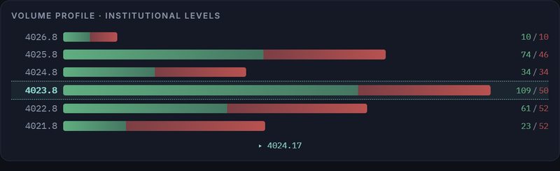
Tap image to view full size. The flow ladder: volume at each price level, with buy and sell counts shown in green and red, and your broker's current price marked in teal.
Each row is a price level. The bar shows how much trading happened there compared to other levels — a long bar means the market spent real effort at that price. The bar is split into green (buying activity) and red (selling activity).
On the right side of each row, you'll see two numbers separated by a slash — for example, 142/89. The green number is how many trades happened on the buying side at that level. The red number is how many happened on the selling side. Together they show both the total activity and the split between buyers and sellers.
The glowing teal marker shows your broker's current price — the "you are here" line.
Why it matters: Levels where a lot of trading happened tend to act as reference points — prices where the market previously found agreement. Many traders watch how price behaves as it gets close to a heavy level: does it slow down, stall, or move straight through? The ladder tells you where those levels sit relative to your current price. During quiet sessions the ladder may show only a few levels; it fills out as activity builds.
5. Broker comparison and spread chart (left column)
The left column starts with two related panels: a comparison table and a spread chart. Together they answer the question: is my broker giving me a fair deal right now?
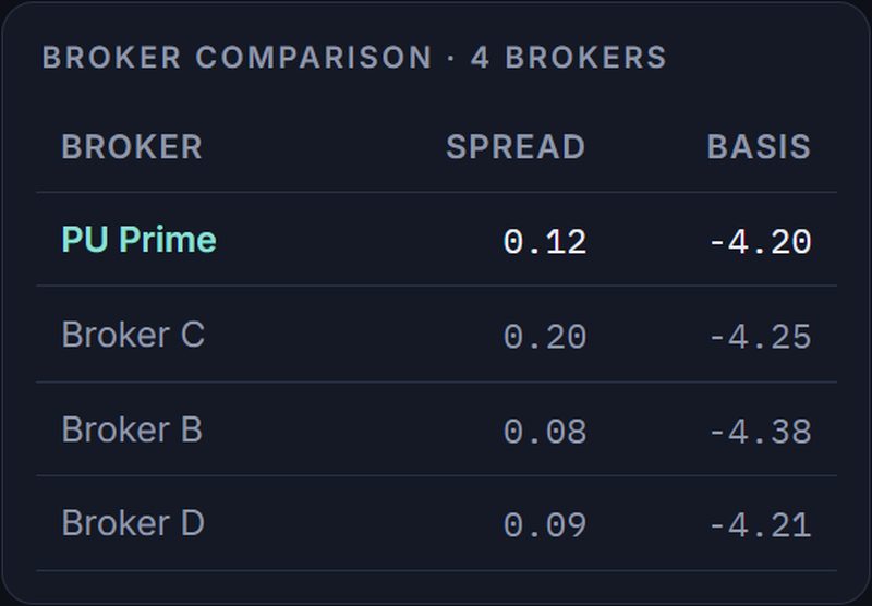
Tap image to view full size. The broker comparison table: your broker highlighted in teal, three anonymized peers with actual spread and basis values.
The broker comparison table
Think of this like a price comparison at a store. The table shows your broker (highlighted in teal) alongside three other brokers (names hidden), with two numbers for each:
| Column | What it shows |
|---|---|
| Spread | How wide the gap is between the buy and sell price at each broker — your cost to trade. Lower is cheaper. |
| Basis | How far each broker's price is from the reference market price. A small number (close to zero) means the broker is pricing close to the reference. A larger number means a bigger gap. |
If your broker's spread is the lowest of the four, you're getting the tightest pricing available right now. If it's the highest, your cost to trade is higher than the others at this moment.
The spread chart (you vs peers)
Below the table, a line chart shows the last 30 minutes of spread history. The teal line is your broker. The soft purple band behind it shows the range — lowest to highest — of the three other brokers at each moment.
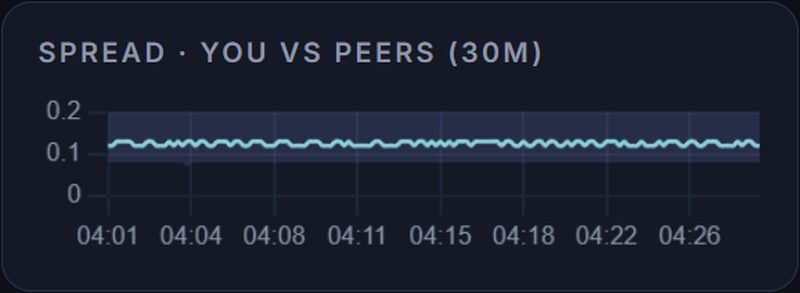
Tap image to view full size. Your broker's spread (teal line) traced against the range of three other brokers (purple band).
How to read it: When the teal line runs inside or below the purple band, your broker is pricing in line with — or tighter than — the others. When the teal line spikes above the band, your broker's spread has gone wider while the others' haven't. That means your cost to trade just went up in a way that isn't explained by the general market. Short widenings around news events are normal everywhere; what's useful to notice is when your line moves alone.
6. The basis deviation index (left column)
Basis is the gap between your broker's price and the reference market price. Some gap always exists, and it slowly drifts through the day — that's normal. What's worth watching is when the gap moves unusually far from where it's been recently.
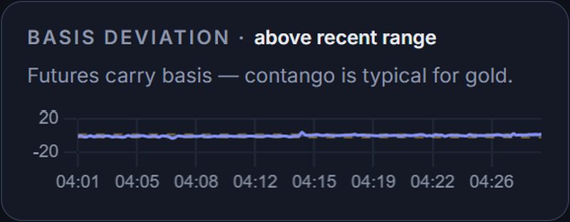
Tap image to view full size. Basis deviation (purple line) with ±2 warning thresholds (amber dashed lines).
This chart shows a single number that answers the question: is the current basis normal or unusual? Here's how to read the purple line:
| Reading | What it means |
|---|---|
| Near 0 | The basis is behaving normally — your broker's gap from the reference is about where it usually is. |
| Between +1 and −1 | Ordinary wobble. Nothing unusual. |
| Beyond +2 or −2 | The gap has stretched unusually far. The dashed amber lines mark this "unusual" boundary. The label above the chart says the same thing in words: "within recent range," "above recent range," and so on. |
Why it matters: A stretched basis often returns toward normal. If you care about the exact price you get in and out at, it helps to know whether your broker's quote is currently at an ordinary or an extreme position compared to the reference.
The section header also shows the current basis value itself (for example, "+$0.42"), so you can see both the raw number and whether it's normal or stretched.
7. The order-flow strip (left column)
This strip sits at the bottom of the left column. It shows the last 60 minutes of trading pressure on the reference market, one colored segment at a time.
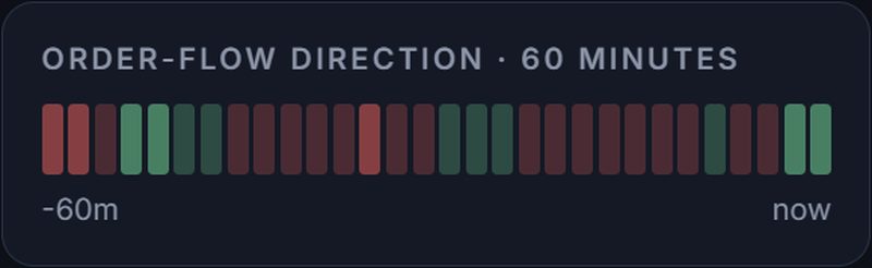
Tap image to view full size. The order-flow strip: 60 minutes of net buying (green) and selling (red) pressure.
Green segments mean more volume traded on the buying side. Red segments mean more traded on the selling side. Brighter colors mean stronger pressure; faint colors mean mild.
A run of bright segments in one color tells you the last stretch of activity was one-sided — the market was leaning heavily in one direction. Alternating faint colors tell you the market was balanced, with no clear direction.
The ⚡ marker appears when a liquidity sweep has been spotted — a burst of aggressive orders clearing out resting orders. Sweeps often happen during sharp moves.
7b. Institutional order flow — the CVD section
The Panel 3 dashboard (open it) adds a full-width section dedicated to CVD — Cumulative Volume Delta. This is a step beyond the colored flow strip on the other dashboards.
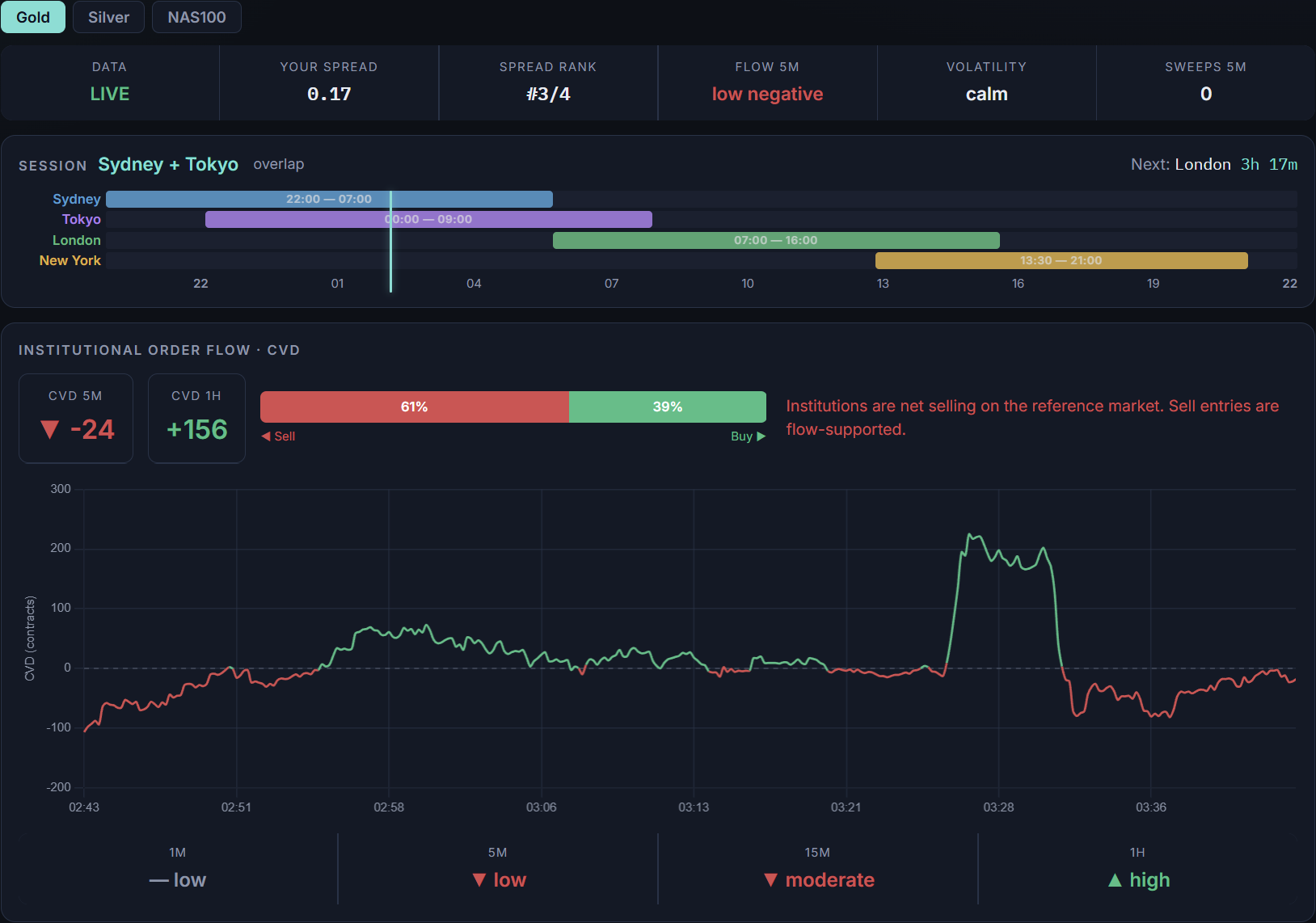
Tap image to view full size. The CVD section on Panel 3: CVD 5m and 1h values on the left, the buy/sell ratio bar in the center, an interpretation sentence on the right (color-matched to the current direction), a 60-minute CVD line chart below, and the multi-timeframe grid at the bottom.
What CVD measures
Every trade on the reference futures exchange has a buyer and a seller, but one side initiated the trade — either the buyer lifted the ask price (a buy aggressor) or the seller hit the bid (a sell aggressor). CVD is the running difference: buy-aggressor volume minus sell-aggressor volume over a given time window.
A CVD of +47 over five minutes means 47 more contracts were initiated by buyers than sellers in that window. A CVD of -80 means sellers were more aggressive by 80 contracts. Zero means both sides pushed equally.
As a CFD retail trader, your broker doesn't show you any of this — you just see a price. CVD bridges that gap by telling you which side of the market the institutional participants are pushing on right now.
What the CVD section shows
The section has four parts, from top left to bottom right:
| Part | What it shows |
|---|---|
| CVD 5m | The contract delta over the last five minutes. Green with an up arrow means net buying; red with a down arrow means net selling. The number is how many more contracts one side traded than the other. |
| CVD 1h | The same measurement over a full hour. Comparing the two tells you whether the short-term pressure matches or diverges from the longer trend. For example, CVD 5m negative but CVD 1h positive means the last few minutes are selling into a broader buying session. |
| Buy/sell bar | A horizontal bar split into green (buy aggressor %) and red (sell aggressor %). If you see 63% green and 37% red, buyers initiated 63% of the volume. This is the same data as CVD but expressed as a proportion instead of a count. |
| Interpretation | A plain-English sentence: "Institutions are net buying on the reference market" or "net selling" or "flow balanced." This is simply what the numbers say in words — not a recommendation. |
The CVD line chart
Below the numbers, a line chart traces CVD over the last 60 minutes. The line is green when above zero (net buying) and red when below (net selling). A dashed gray line marks the zero level. This gives you the shape of how flow has evolved — was it one-sided all session, or did it flip? Did it build gradually or spike suddenly?
The multi-timeframe grid
At the bottom of the CVD section, four compact tiles show the flow direction across four timeframes: 1 minute, 5 minutes, 15 minutes, and 1 hour. Each shows an arrow and a magnitude (low, moderate, high). When all four agree — for example, all showing green up arrows — the flow is strongly one-directional across timeframes. When they disagree, the picture is mixed.
How to use it
CVD tells you whether the people trading on the real exchange are pushing in the same direction you're considering. If CVD 5m is strongly positive and you're thinking about a buy entry, institutional flow supports your direction. If you're buying while CVD is deeply negative, you're trading against the institutions. It doesn't guarantee anything, but it's a directional bias signal that retail traders otherwise have no access to.
A common pattern: check the CVD section before entering a trade and ask, "Is the reference market leaning the same way I am?" If yes, the conditions are aligned. If not, you at least know you're swimming upstream.
Reading the colors and commentary
Every element in the CVD section is color-coded to match the current flow direction. When institutions are net buying, numbers and text turn green. When net selling, red. When balanced, gray. This extends to:
| Element | What changes |
|---|---|
| CVD 5m value | The number and arrow turn green (▲) for net buying, red (▼) for net selling, gray (—) for balanced. |
| CVD 1h value | Same color logic — may differ from the 5m if short-term and long-term flow diverge. |
| Buy/sell bar | The green and red portions resize to match the current ratio. A bar showing 61% red and 39% green means sell aggressors dominated in the last 5 minutes. |
| Interpretation text | The sentence itself
changes color to match the direction. Three possible messages: "Institutions are net buying on the reference market. Buy entries are flow-supported." "Institutions are net selling on the reference market. Sell entries are flow-supported." "Institutional flow is balanced — no strong directional conviction." |
| CVD line chart | The line is green when above the zero line, red when below. A chart that transitions from green to red shows flow shifting from buying to selling. |
| Multi-TF tiles | Each timeframe tile independently colors its arrow and magnitude word. When all four are the same color, the flow is aligned across timeframes. |
The commentary is descriptive, not prescriptive — it tells you what the data shows, not what you should do. "Sell entries are flow-supported" means institutional flow currently favors the sell direction; it is not a recommendation to sell.
8. Observations (right column)
The Observations feed sits below the flow ladder in the right column. It's the dashboard writing down what it notices, in plain sentences: spread-widening events, sweeps, unusual conditions, the reference market being closed, or data being delayed.
Think of it as the "anything I should know?" panel. When it says "Nothing unusual observed right now," that is itself useful information: conditions are ordinary.
One entry you may see: "Reference market closed — broker-relative observations only." The reference market has a daily pause and weekend closure, while CFD brokers may still quote prices during those times. During those windows we can still compare brokers with each other, but reference-based measurements (basis, flow, ladder) pause. We say so rather than showing you stale numbers.
9. Telegram alerts
Link your Telegram account to get alerts on your phone without keeping the dashboard open. There are two types of alerts: window alerts (condition-based) and session reminders (schedule-based).
Window alerts
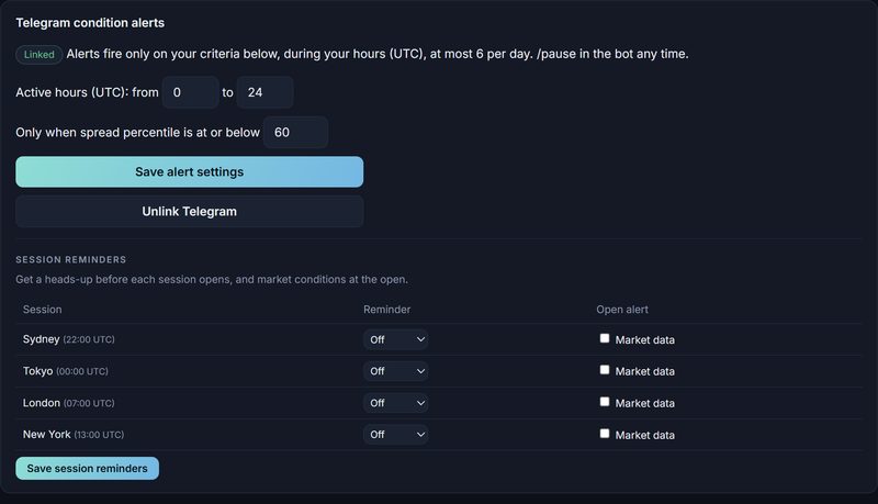
Tap image to view full size. Telegram alert settings on the Account page: your active hours, spread threshold, and session reminder controls.
On the Account page, click "Link Telegram" and follow the bot link. Once linked, you can set your alert hours (UTC) and the spread percentile threshold that triggers alerts. Alerts fire at most 6 times per day, only during your specified hours, and only when your criteria are met. You can pause and resume at any time with /pause and /resume in the bot.
Session reminders
Once Telegram is linked, you'll see a "Session reminders" section on your Account page. For each of the four trading sessions (Sydney, Tokyo, London, New York), you can set two things:
| Control | What it does |
|---|---|
| Reminder | A heads-up sent before the session opens. You pick how far ahead: 5 minutes, 15 minutes, or 30 minutes — or turn it off. For example, setting London to "15 min" sends you a message at 06:45 UTC saying "London session opens in 15 minutes." |
| Open alert | When the session opens, you get a message with the current market conditions: your spread, the flow direction, and the volatility state. This tells you what the environment looks like the moment the session begins — without having to open the dashboard. |
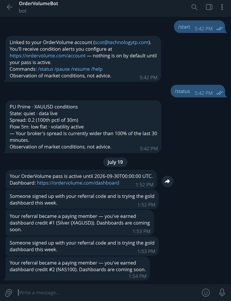
Tap image to view full size. The OrderVolume Telegram bot: linking confirmation, status check, pass activation, and referral credit notifications.
Each reminder fires once per session per day. They only work while you have an active pass and a linked Telegram account.
10. Referral program
Every subscriber gets a unique referral code. Share your link with someone and when they sign up, they get a free week of the gold dashboard — no payment needed.
For every three friends who go on to become paying members, you earn one additional asset dashboard as new markets launch. Your Account page shows your progress — for example, "2 of 3 paying referrals toward Silver."
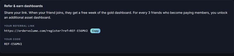
Tap image to view full size. The referral panel on your Account page: your shareable link, referral status, and progress toward dashboard credits.
Your referral link and code are on the Account page. Dashboard credits unlock in a fixed sequence as new asset dashboards are built: Silver, NAS100, DJ30, WTI Oil, XAUEUR. Credits earned beyond the available dashboards are banked for future releases.
How the math works: 3 paying referrals = 1 dashboard credit. 6 paying referrals = 2 credits. And so on. If a referred friend's access lapses, there is a 7-day grace window before the credit is affected.
11. Putting it together
OrderVolume doesn't tell you what to trade — you already have your own method. What it adds is a condition check that most retail traders never have. Three questions you can answer in about five seconds:
"What is it costing me to trade right now?"
Look at: the Your spread chip and the Spread rank chip. If your rank is #1/4 and the spread number is small, your cost is low. If your rank is #4/4, you're paying the most of the four brokers right now. The same trade placed ten minutes later at a tighter spread costs measurably less.
"Is my broker behaving normally right now?"
Look at: the broker comparison table (are your numbers in line with the others?) and the basis deviation chart (is the purple line near zero?). When both are ordinary, your trading environment is ordinary. When either is stretched, you at least know the conditions you're acting in.
"What has the market actually been doing underneath?"
Look at: the flow strip (has recent activity been one-sided or balanced?) and the flow ladder (where are the heavy levels relative to your price?). Price alone doesn't show whether a move happened on strong one-sided activity or thin, balanced churn. The flow strip and ladder do.
A simple routine: glance at the chips (state and cost), check the session timeline (who's open), check whether your spread is in line with the peers, note the flow strip's recent color, and find the nearest heavy ladder level relative to your current price. Fifteen seconds, and you know the conditions. What you do with that is your decision.
12. Glossary
| Term | Meaning |
|---|---|
| CFD | Contract for difference — the product your broker offers. You trade the price of gold without owning gold. Your counterparty is the broker. |
| Reference market | The futures exchange where gold's global price is set. OrderVolume uses data from it as the measuring stick. The raw exchange data itself is not displayed (that requires separate licensing). |
| Spread | The gap between your broker's sell (bid) and buy (ask) prices, in dollars. You pay the spread on every round trip. Gold spreads breathe: tight in busy hours, wide in thin ones. |
| Basis | The difference between your broker's price and the reference market price at the same moment. |
| Deviation index | A number that shows how far a reading is from its own recent average. 0 = normal, ±1 = ordinary wobble, beyond ±2 = unusual. Think of it as a "weirdness meter" — the further from zero, the more unusual. |
| Percentile | Where a value ranks within its recent history. A spread at the 90th percentile is wider than 90 out of 100 readings in the window. |
| CVD (Cumulative Volume Delta) | The running difference between buy-aggressor volume and sell-aggressor volume on the reference exchange over a time window. Positive = more buying pressure, negative = more selling pressure. Panel 3 shows the raw contract count; other dashboards show its direction and strength (low / moderate / high). See section 7b for details. |
| Flow / volume delta | Another name for CVD (above). Used on the status chips and order-flow strip. |
| Liquidity sweep | A burst of aggressive orders that clears out resting orders at several prices in one push. Sweeps mark moments of urgency and often happen during sharp moves. |
| Volume profile / flow ladder | A map of how much trading happened at each price level. Long bars = prices the market spent real effort at. The numbers on the right show the buy/sell split. |
| Buy / sell participation | Within a ladder level, the number of trades that happened on the buying side versus the selling side. Describes what happened — not a suggestion. |
| Broker comparison table | A side-by-side view of your broker's spread and basis alongside three other brokers (names hidden). Like a price comparison — you can see what you're paying and what the others charge. |
| Broker frame | Prices expressed in your broker's own quote, not the exchange's. Everything on your dashboard is in broker frame, so it matches your trading platform. |
| Session | A named block of market hours when a major financial center is active. OrderVolume tracks four: Sydney, Tokyo, London, and New York. Each has fixed UTC open and close times shown on the session timeline. |
| Session overlap | A period when two sessions are open at the same time — for example, London and New York from 13:00 to 16:00 UTC. Overlaps tend to have higher volume and tighter spreads. |
| Dead zone | The hour between New York close (21:00 UTC) and Sydney open (22:00 UTC) when no major session is active. Spreads are typically at their widest during this hour. |
| Volatility state | A summary of current turbulence: calm, active, or elevated — based on how much the market is moving and how far apart brokers are pricing from each other. |
| Widening event | A spread reading more than double the recent middle value — a spike in your cost to trade. |
| LIVE / DELAYED | Whether our own measurements are current. DELAYED means treat everything on screen as stale until it clears. |
| Pass | Your access period. Weekly (7 days, $89.95) or monthly (30 days, $369.95) from the moment it's activated. Paying again while a pass is active adds time on top. Passes simply expire — there is no auto-billing. |
13. What OrderVolume is not
OrderVolume is a measurement instrument. It does not give trade recommendations, predictions, or advice. Nothing on the dashboard is a suggestion to open or close any position. It describes conditions; your decisions, strategy, and risk management are entirely your own.
CFDs are leveraged products and most retail traders lose money trading them — trade only with capital you can afford to lose.
Practical notes: one account covers one broker (a second broker means a second account and pass). Multi-hour data outages during your pass are compensated with extra days. Have a broker you'd like covered? The registration page logs your request.